Today is day 21 of my challenge of learning 3d. I want to create a Tokyo street scene in 3d. I’ve never done any real 3d before. Yesterday I learnt how to make complex shapes. Today I’m playing with making high-res textures and try to make everything look less gaming and more photorealistic.
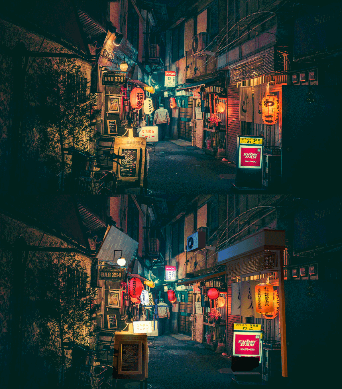
As always, here’s what I’m trying to make in 3d:
High res textures
The problem with trying to recreate a photo in 3d is that even if the original photo is high-res, cutting out textures from the the small objects will still mean they’re relatively low-res. Also they’ll probably won’t be neutral textures. They’ll be affected by the overall coloring of the scene, lights and reflections.
So I’ll have to recreate them by hand. Which is fun as well.
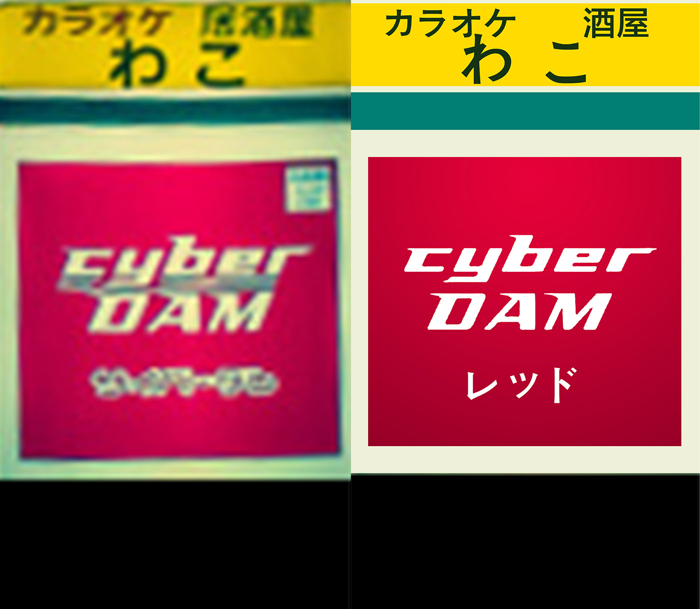
For example, left is the original texture from the photo and right my hand made.
When you render it, it looks like this:
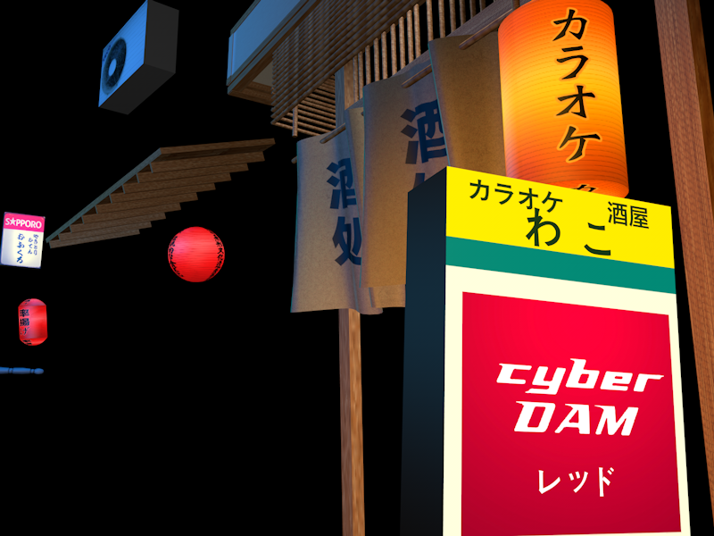
The coloring looks a bit different (from purple to red) because I know the scene has a blue tint itself, so that probably has made the red look purple when it is in fact red.
Recreating the Japanese characters is hard when you don’t understand Japanese characters. So I used Google Translate’s photo option to read the text and then copy the characters into Photoshop as text.
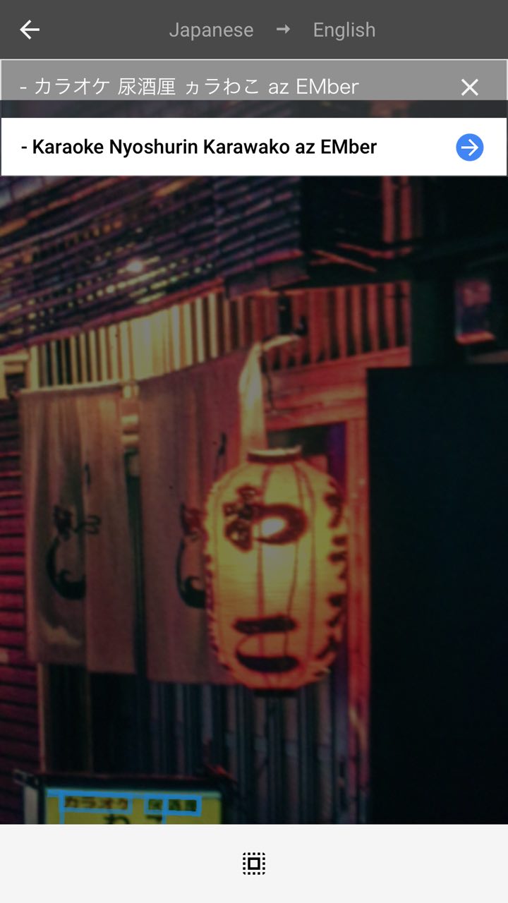
That didn’t always work with the original photo as sometimes the characters didn’t show completely, so I used similar photos of Tokyo streets to get the right characters.
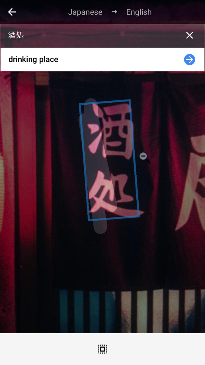
Funnily enough to me, they always looked like decoration. But they simply mean stuff like “Drinking Place” and “Karaoke”. Doh. I should have known. Stupid Waigouren!
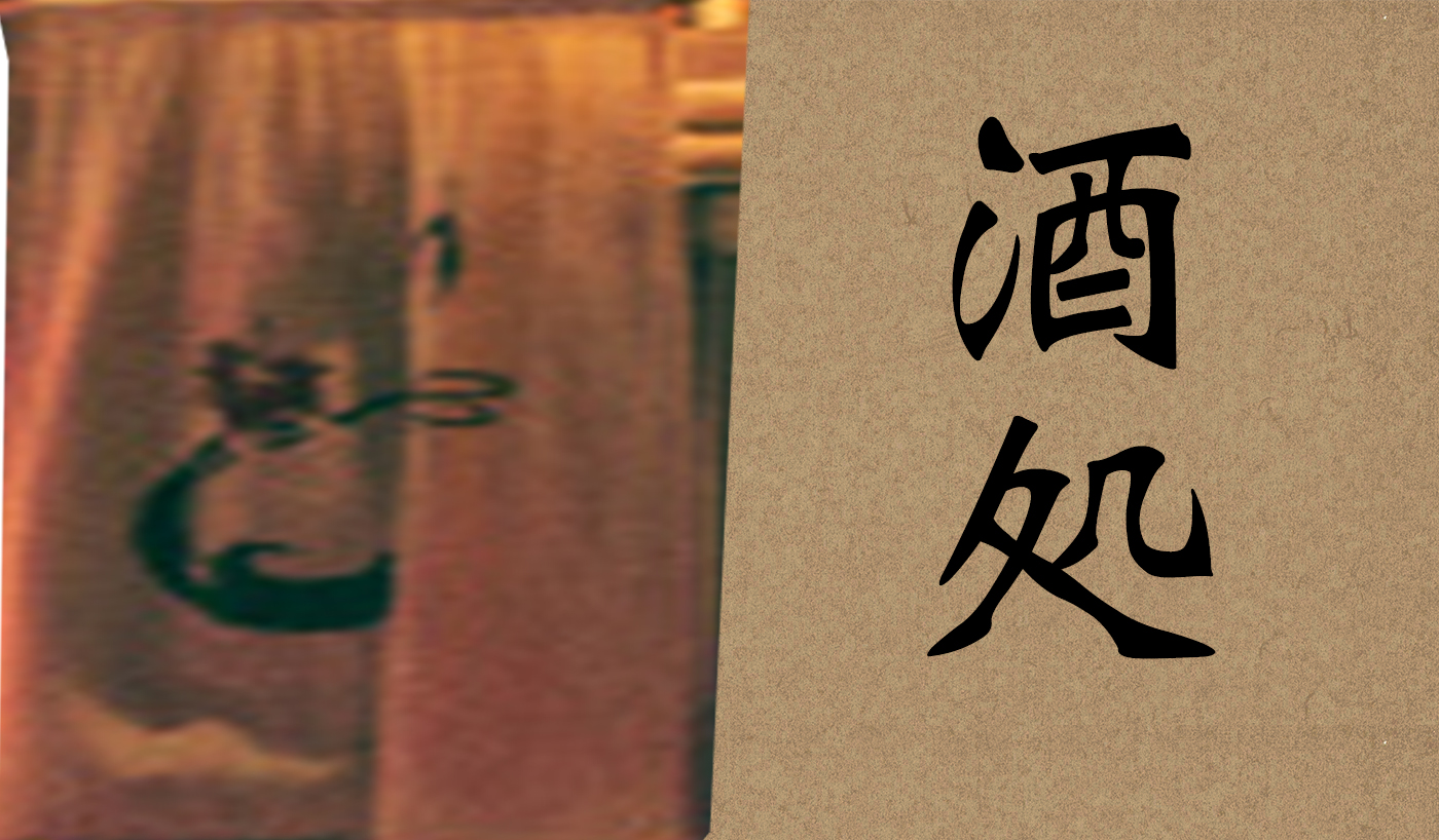
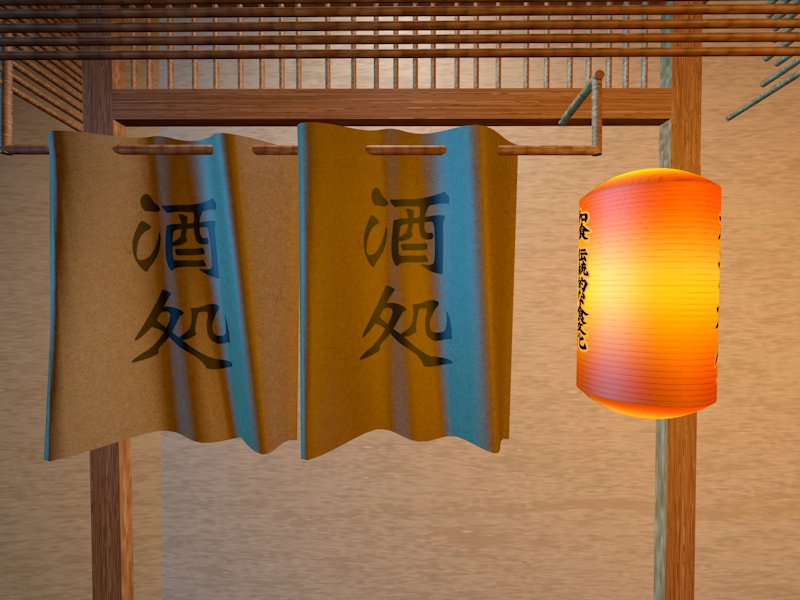
The text doesn’t match up, but I might fix this later if I figure out what the hell is written on that curtain.
Here’s another problem, I have fat Chinese/Japanese/Kanji fonts that look modern and clean, but most traditional fonts are very light weight.
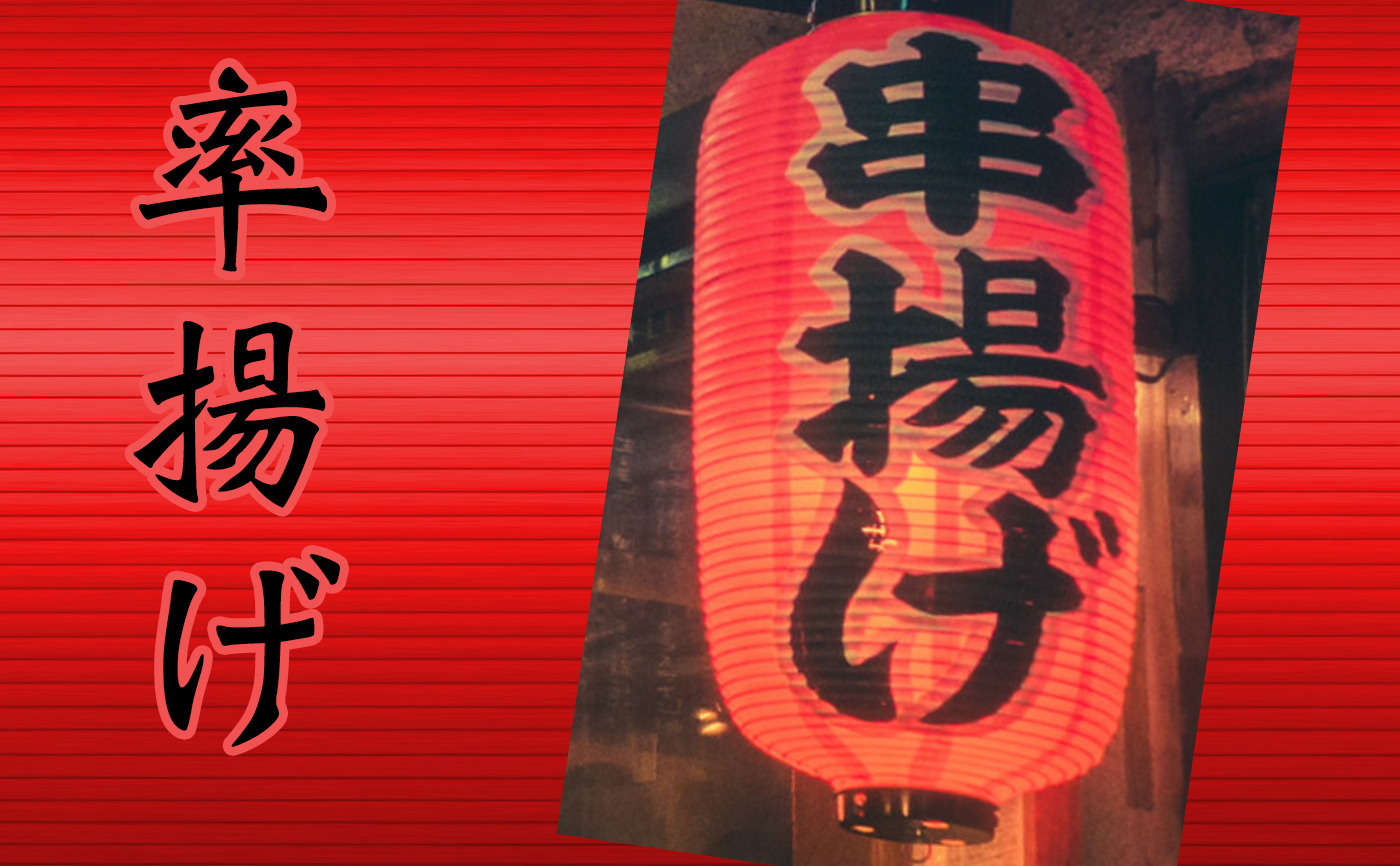
At some point, I’ll have to find the right fonts to make it match up better.
Physical rendering and ambient occlusion
Someone on Twitter said I should change my render settings to make it look more realistic.
@levelsio set the renderer to physical, add ambient occlusion and global illumination to make it look more realistic (and to heat your Mac)
— Cornelius (@ccoryoso) February 22, 2016
So here we go:
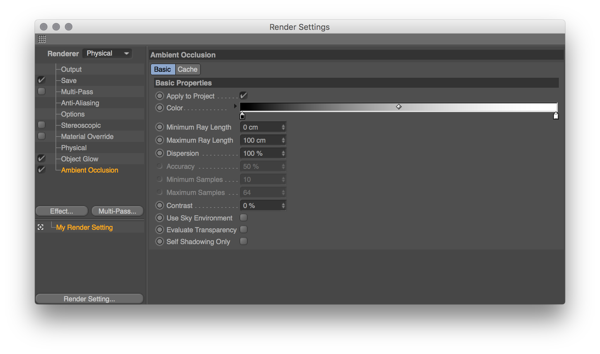
That worked well, the difference is small but still pretty striking. It seems it creates better shadows:
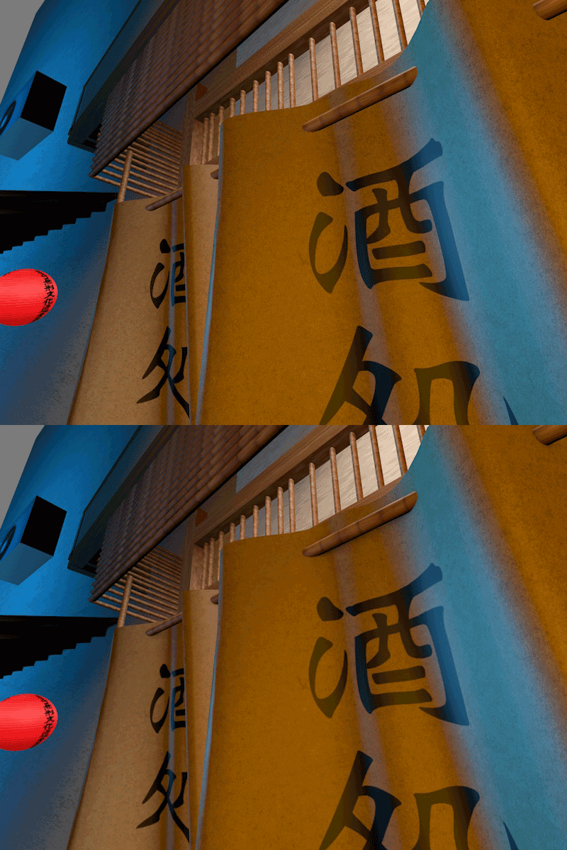
It’s pretty crazy to me how as a noob, it’s relatively easy to make a somewhat photo realistic looking scene in just a few weeks already. The most important is having high-res textures, and creating detailed shapes and combinations of shapes, and you already get pretty close.
This is how it looked on my first day:
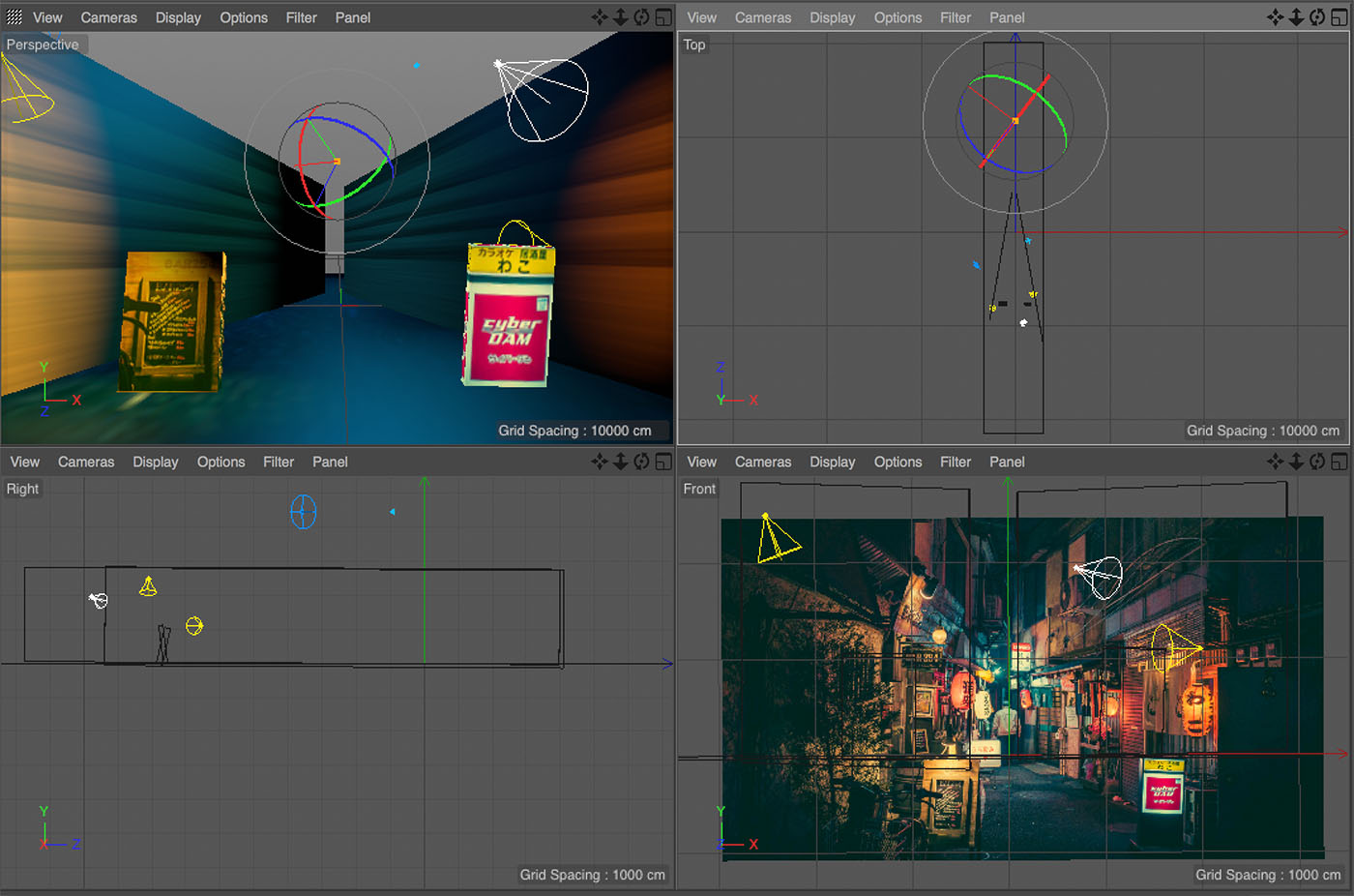
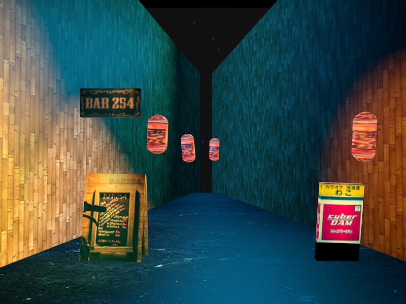
Now we’re here:
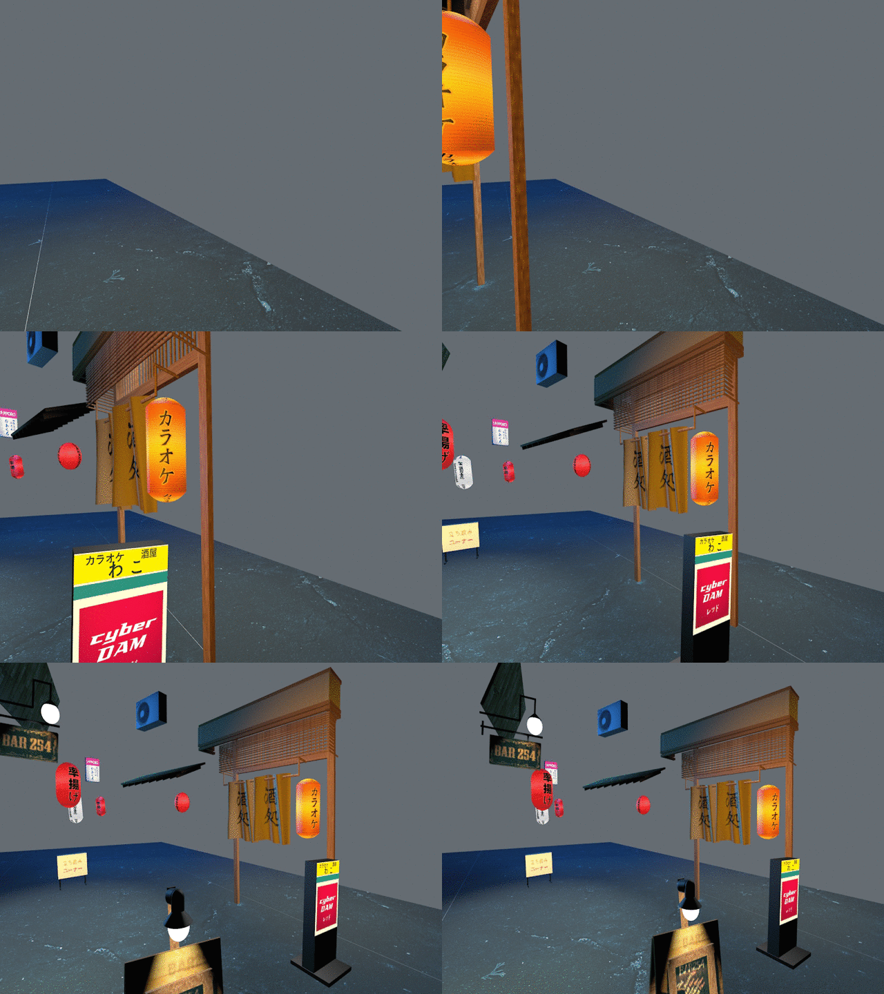
And thanks to SketchFab, you can now watch it in their 3d viewer:
What’s next
In the next few days I’ll do a sprint to complete the scene by adding more models. Preferably, I’ll not need an actual big wall like before as the store fronts I’ll model will be enough to act as the wall. After that the challenge is getting the lighting right.
Tomororow I’ll add rain, blinking lights and make it into a site
P.S. I'm on Twitter too if you'd like to follow more of my stories. And I wrote a book called MAKE about building startups without funding. See a list of my stories or contact me. To get an alert when I write a new blog post, you can subscribe below: